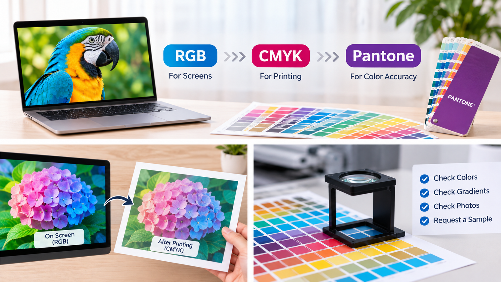
If you have ever worked on designs for packaging, flyers, business cards, or product labels, you have probably heard designers or printing companies mention CMYK. Although it consists of just four letters, CMYK plays an important role in determining whether the colors you see on your computer screen will look the same when printed.
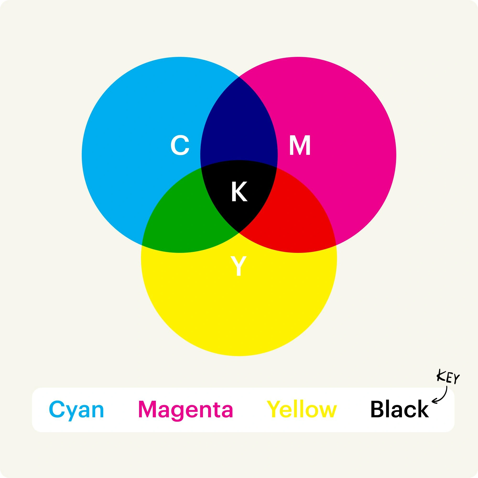
CMYK is the most commonly used color model in commercial printing. It uses four ink colors to create a wide range of colors: Cyan, Magenta, Yellow, and Black (represented by K). It is widely used for printed materials such as packaging boxes, posters, magazines, and product instruction manuals.
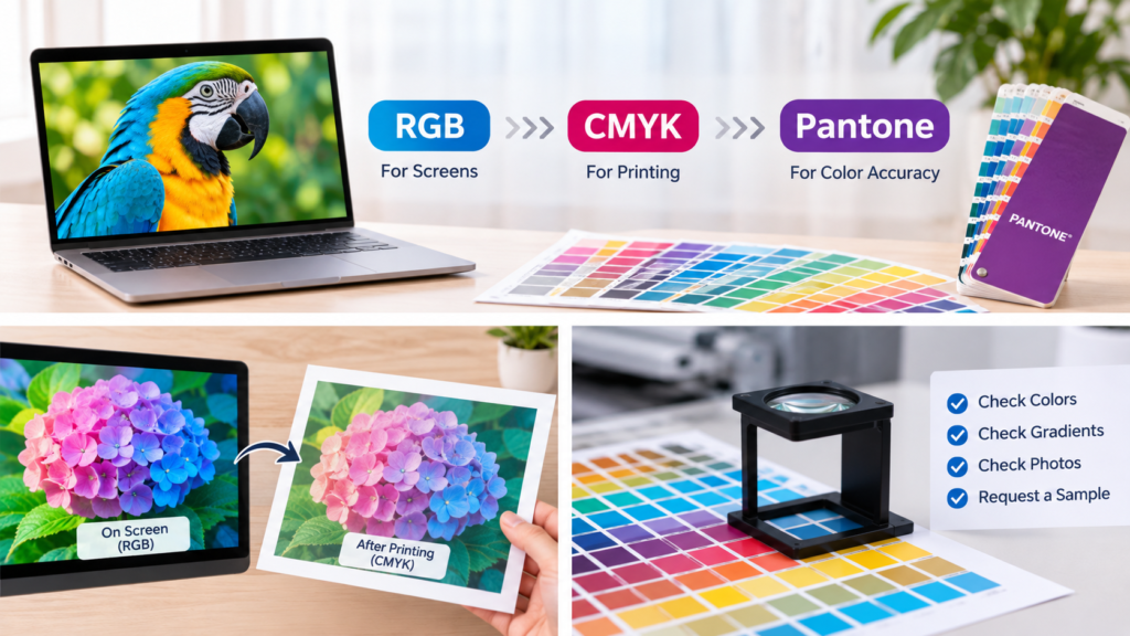
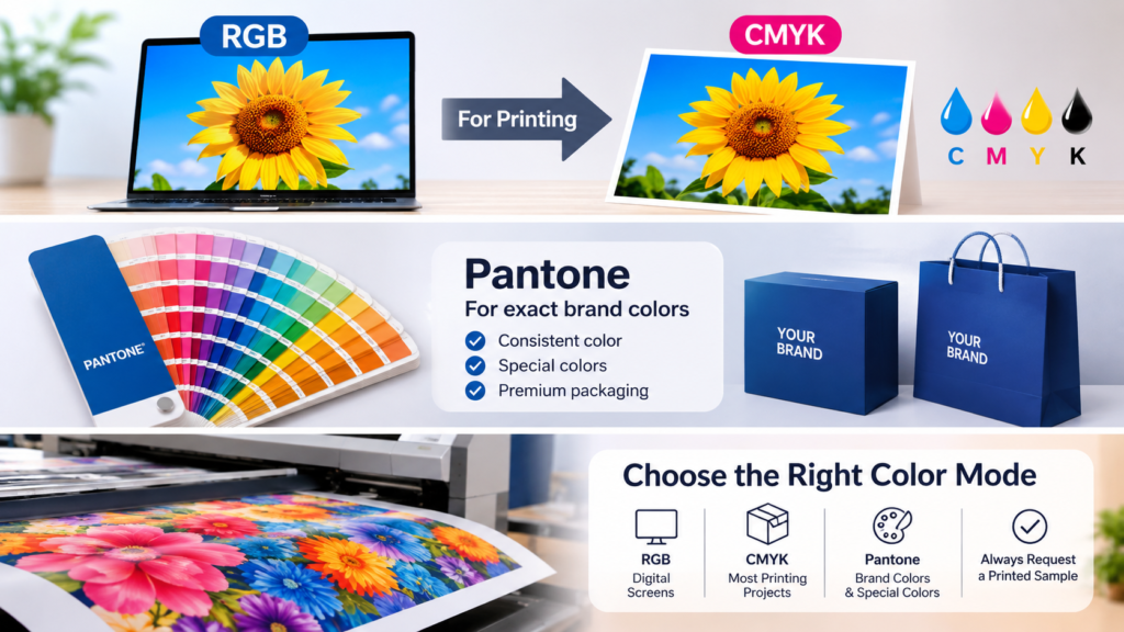
There are also two other color systems worth knowing about. RGB is mainly used for displaying colors on digital screens, such as smartphones and computers. Pantone, on the other hand, is commonly used for spot color printing when brand colors need to be highly accurate and consistent across different printed materials.
This article explains what CMYK is, how it works, how it differs from RGB and Pantone, what to consider when converting RGB to CMYK, and how to use CMYK correctly in packaging printing.
What Is CMYK?
CMYK is a color model used for printing. The four letters represent four different ink colors: C stands for Cyan, M for Magenta, Y for Yellow, and K for Black. That’s why it’s also known as four-color printing. During the printing process, the printer controls the amount of each ink and combines tiny dots of these four colors to create different colors and effects, including photographs, illustrations, and gradients.
For example, you may come across a CMYK color value like this: C: 82, M: 19, Y: 15, K: 0. This means the color is made up of 82% Cyan, 19% Magenta, 15% Yellow, and 0% Black ink. It’s important to understand that these numbers are not ordinary color codes used on computer screens. Instead, you can think of them as a color recipe that tells the printing company how much of each ink to use to achieve the desired color.
You may also wonder: Black starts with the letter B, so why does CMYK use K instead? There are two main reasons. First, using B could cause confusion with RGB, where B already stands for Blue. Second, K comes from the word “Key.” In traditional printing, the black printing plate is known as the Key Plate. It plays an important role in making text, outlines, shadows, and other dark details look sharper and clearer in the final print.
How Does CMYK Work?
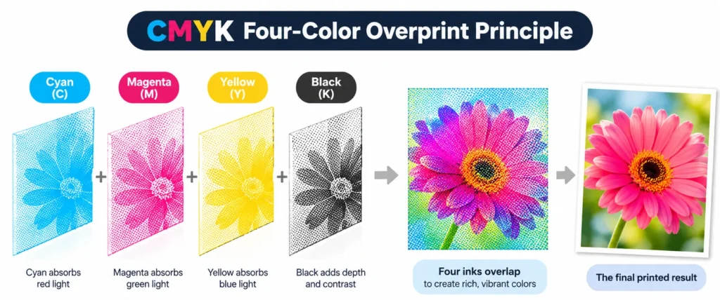
CMYK is known as a subtractive color model, which works differently from the colors you see on your phone or computer screen. Screens produce their own light and use three colors—Red, Green, and Blue (RGB)—to create different colors. When all three colors of light are combined at full strength, they produce white. Printing works differently because paper does not produce light. Instead, light falls on the printed surface, and the ink absorbs certain parts of that light while reflecting the rest back to our eyes. This is how we see printed colors.
You can think of CMYK inks as four layers of colored filters. Cyan absorbs red light, Magenta absorbs green light, and Yellow absorbs blue light. Black ink helps create deeper shadows, darker text, and stronger contrast. As more ink is added, more light is absorbed, making the printed color appear darker. That’s why CMYK is called a subtractive color model. Before printing, the design is separated into four color layers: Cyan, Magenta, Yellow, and Black, with each layer corresponding to one type of ink.
During printing, these four color layers need to line up correctly on the paper. This process is called color registration. The printing machine applies each ink in the right position and proportion to create the final image. If the layers are not properly aligned, text may look blurry, images may appear doubled, and colors may shift. That’s why printing companies usually check colors and produce a sample before starting mass production. This helps identify potential issues early and ensures the final packaging looks as expected.
What Is the Difference Between CMYK, RGB, and Pantone?
CMYK, RGB, and Pantone are three different color systems used in printing, digital displays, and brand color matching.
| Comparison | CMYK | RGB | Pantone / PMS |
|---|---|---|---|
| Full Name | Cyan, Magenta, Yellow, Key (Black) | Red, Green, Blue | Pantone Matching System |
| Color Principle | Subtractive color model, using ink to absorb light | Additive color model, using light to create colors | Uses pre-mixed spot color inks |
| Common Medium | Paper, packaging, labels, brochures | Computers, smartphones, TVs, websites | Brand identity, packaging, specialty printing |
| Main Applications | Full-color photos, illustrations, and gradients | Websites, apps, social media, and videos | Brand colors and precise color matching |
| Color Consistency | Affected by paper, ink, printing equipment, and conditions | Affected by screen type, brightness, and color settings | Generally offers more consistent color reproduction when the same Pantone standard and printing conditions are used |
| Cost & Efficiency | Usually more economical for large-volume, multi-color printing | Not suitable for direct printing output | More precise color matching, but may involve higher costs and additional production steps |
When Should You Use CMYK, RGB, or Pantone
CMYK is best for full-color printing projects, especially those involving photographs, illustrations, and gradients.
RGB is designed for digital displays, including websites, mobile apps, and social media.
Pantone (PMS) is ideal for projects that require accurate and consistent brand colors, especially custom printed packaging.
Why Does Printing Use CMYK Instead of RGB?
RGB is designed for digital screens, such as computers and smartphones, which produce their own light to display colors. Printing works differently because it uses ink on paper, and the colors we see come from reflected light. That’s why RGB and CMYK work in different ways, and the colors displayed on a screen may not look exactly the same when printed.
When an RGB image is sent for printing, it usually needs to be converted to CMYK first. During this process, some bright and vivid colors may look different. For example, neon blue may appear more purple or gray, bright green may look darker, and vivid orange may become slightly redder or browner. Bright purple may also look less vibrant after printing.
The main reason is that RGB has a wider color range (gamut) than CMYK. In other words, screens can display some colors that standard CMYK printing inks cannot fully reproduce. To get a more accurate idea of the final printed result, it’s best to prepare your artwork in CMYK and check the colors before production.
The Advantages and Disadvantages of CMYK Printing
CMYK printing is a popular choice for packaging because it works well with designs that contain multiple colors, photos, illustrations, and gradients. It is also more cost-effective than using separate spot colors for designs with many colors. From business cards and brochures to custom boxes, labels, and paper bags, CMYK is widely used for both small and large printing projects.
However, CMYK also has some limitations. The final colors can vary depending on the paper, ink, and printing conditions. Some very bright colors may look darker or less vibrant after printing. Special colors such as metallic gold, silver, neon colors, and certain brand colors can also be difficult to reproduce accurately with CMYK alone. Even if your artwork is set to CMYK, the colors on your computer screen may still look different from the final printed result.
Why Do Colors Look Different After RGB to CMYK Conversion?
Have you ever noticed that a color looks bright on your computer screen but becomes darker after printing? This is quite common.
The reason is simple: screens can show more colors than printing inks can produce. When an RGB design is prepared for printing, some bright colors have to be adjusted. For example, bright blue, green, and purple may look darker or less vibrant on paper.
What Should You Check Before Printing?
Before sending your design to print, take a moment to check these details:
Light backgrounds: Do white and light-colored areas still look clean?
Brand colors: Do your logo and brand colors still look right?
Bright colors: Have blue, green, or purple become darker?
Gradients: Do the colors blend smoothly?
Photos: Do skin tones, food, and other details still look natural?
Black text: Is the black color suitable for clear, sharp printing?
Screen colors may look different from printed colors. If color accuracy is important to your brand, it’s best to check a printed sample before mass production to make sure the colors meet your expectations.
How to Set Up CMYK for Printing?
If you are preparing artwork for printing, it’s important to use the correct color settings. Here are three simple ways to prepare your files for print.
Method 1: Convert RGB to CMYK in Photoshop
If you already have an image in RGB format, you can easily convert it to CMYK in Photoshop.
- Open your image in Adobe Photoshop.
- Save a copy of the original file so you can keep it unchanged.
- Go to Image > Mode > CMYK Color.
- Check whether any colors look different after conversion.
- Adjust the colors if needed, especially bright colors and dark areas.
This method is useful for photos, posters, flyers, and other image-based designs.
Method 2: Create a CMYK Document in Illustrator
If you are designing packaging, logos, business cards, or labels in Adobe Illustrator, it’s best to choose CMYK when creating a new document.
- Open Adobe Illustrator and create a new document.
- Find the Color Mode setting.
- Select CMYK Color.
- Set the correct document size and add the required bleed.
- Use CMYK color values when designing your artwork.
This helps you prepare your design for printing from the beginning and reduces unexpected color changes later.
Method 3: Keep RGB Files and Convert Them Before Printing
If you plan to use the same design for both websites and printed packaging, you don’t have to convert everything to CMYK right away.
You can keep the original design in RGB for digital use and create a separate CMYK copy when preparing it for printing. This way, you can use the same artwork for both online and printed materials while keeping the original colors available for future use.
When Can Pantone Be Replaced with CMYK?
Pantone uses specially mixed inks to produce specific colors, making it a good choice when a brand needs its colors to look consistent across different packaging and printed materials. It is especially useful for company logos, brand colors, and luxury packaging where color accuracy is important.
However, Pantone is not always necessary. If your packaging includes photos, colorful designs, or gradients, CMYK is usually a more practical and affordable option. It is also suitable when your budget is limited or small color differences are acceptable. Pantone Color Bridge can help you find the closest CMYK match to a Pantone color and see how the printed results may differ.
When choosing between Pantone and CMYK, consider your brand requirements, budget, and printing method. If your logo or brand color must match closely, Pantone is usually the better choice. If your design contains many colors and images, CMYK is often enough. Keep in mind that converting a Pantone color directly to CMYK in Adobe software may produce a different result from the CMYK reference in Pantone Color Bridge. If you need to follow the Color Bridge reference, choose the color directly from its library.
Conclusion
Choosing the right color mode helps make sure your printed packaging looks the way you expect. RGB is for digital screens, CMYK is suitable for most printing projects, and Pantone is a good choice when you need specific brand colors to match closely.
Before printing your packaging, always check your artwork and color settings. If you are unsure about the final colors, ask for a printed sample first. This way, you can check the colors before mass production and avoid unnecessary changes later.
Still not sure whether CMYK or Pantone is the right choice for your packaging?
Contact LucklinPak today! We’ll be happy to help you choose the right printing method and color solution for your custom paper bags, gift boxes, and other packaging projects.