Why Your Print Colors Look Different from Screen Colors
Have you ever had this happen? Your design looks super bright and vibrant on the screen, but once you print it, it comes out looking dull and gray—completely different from what you expected. Many designers and brands face this issue, especially when creating custom packaging,custom boxes or custom bags . The reason is simple: we don’t fully understand the difference between screen colors and print colors.
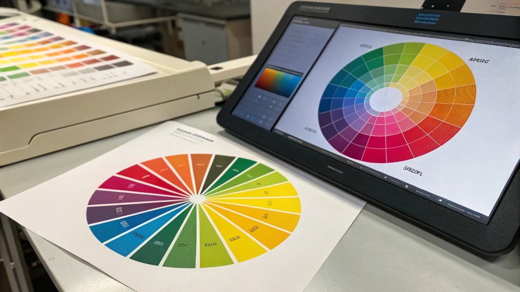
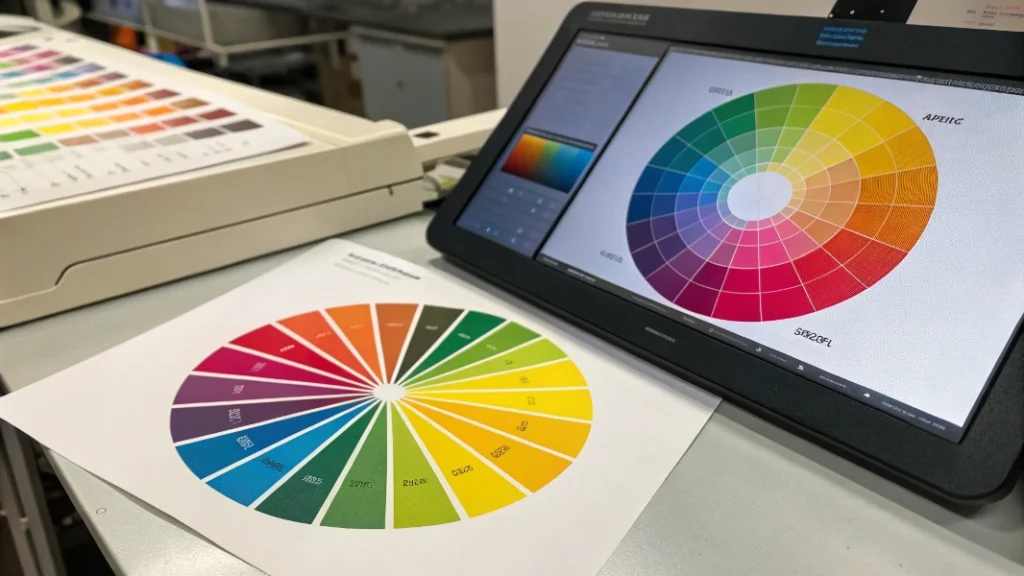
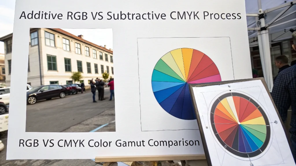
Screens display color using light, known as RGB (Red, Green, Blue). This combination creates bright, vivid, almost glowing colors. Printing, however, uses CMYK (Cyan, Magenta, Yellow, Black) inks. Some of the super-bright colors on your screen cannot be reproduced exactly with ink. Sending your design straight to print without adjusting it can result in dull, muted colors, far from what you expected.
Getting this right is crucial for anyone creating visuals for both digital screens and print materials. Misunderstanding RGB vs CMYK can lead to wasted time, money, and frustration.
Understanding RGB and CMYK Color Models
RGB Explained
- Used for: Screens, digital devices (phones, monitors, cameras)
- How it works: Starts with black and adds red, green, and blue light. Mixing all three at full power gives white.
- Strengths: Produces bright, vibrant colors with a wide color range (gamut), almost glowing.
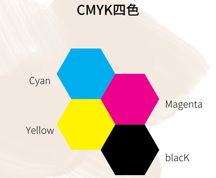
CMYK Explained
- Used for: Printing on paper or physical surfaces
- How it works: Starts with white paper. Inks act like filters: cyan blocks red, magenta blocks green, yellow blocks blue. Black (K) is added for true dark shades and contrast.
- Limitations: Cannot reproduce all bright RGB colors; color range (gamut) is smaller.
| Feature | RGB (Screen) | CMYK (Print) |
|---|---|---|
| Basis | Emits light | Reflects light / ink absorption |
| Model Type | Additive | Subtractive |
| Used For | Digital displays | Print materials |
| Gamut | Wide (more vibrant colors) | Narrower (less bright colors) |
Which Color Mode Should You Use for Printing?
For almost all commercial printing—like brochures, business cards, packaging—CMYK is the standard choice. Printers use physical inks, so designing in CMYK from the start gives a more realistic preview of your printed colors.
Using RGB files may lead to unexpected results because printers will convert them to CMYK automatically. This can dull bright or neon colors. Designing in CMYK allows you to proactively adjust colors and avoid surprises.
Why Does CMYK Look Duller Than RGB?
CMYK often looks less bright because screens emit light while ink reflects it. Screens can produce pure, intense colors, almost glowing. Ink absorbs light, so printed colors always appear less vibrant.
Additionally, CMYK has a smaller color gamut. Many RGB colors, like neon blues or vibrant oranges, cannot be reproduced exactly in CMYK. When converting RGB to CMYK, the software approximates the closest printable color, which may look duller.
How to Convert RGB to CMYK Accurately
Converting RGB to CMYK yourself is crucial for control and predictability. Here’s a reliable workflow:
- Use Professional Software: Adobe Photoshop, Illustrator, or InDesign.
- Calibrate Your Monitor: Provides a more consistent view for color adjustments.
- Get the Correct ICC Profile: Ask your printer for the recommended CMYK profile for their press and paper type.
- Convert Files:
- Photoshop: Edit > Convert to Profile → Destination Space = CMYK profile → Rendering Intent = Perceptual/Relative Colorimetric → Black Point Compensation = On
- Illustrator/InDesign: Set document intent to Print, color mode to CMYK, and manage conversions via Color Settings and Convert to Profile.
- Soft Proofing: Use the target CMYK profile to simulate printed colors on your screen. Adjust colors as needed.
- Export PDF Properly: Ensure Color Conversion is correct and the ICC profile is embedded.
Manual RGB-to-CMYK conversion is not practical; software ensures accurate and consistent results. You can fine-tune specific colors after conversion if needed.
Tips for Vibrant Blues in CMYK
- Maximize Cyan (primary blue ink)
- Keep Magenta moderate (30–70%) to avoid purple tints
- Minimize Yellow to maintain brightness
- Avoid Black in bright areas
- Use coated paper for better vibrancy
- Consider Pantone spot colors for brand-specific bright blues
Example CMYK mixes for blue (results vary by press and paper):
| Blue Type | C | M | Y | K | Look |
|---|---|---|---|---|---|
| Strong Royal Blue | 100% | 70% | 0% | 0% | Bright, standard blue |
| Cleaner Bright Blue | 100% | 50% | 0% | 0% | Slightly less purple |
| Deep Blue | 100% | 80% | 0% | 10–20% | Darker, richer |
| Sky Blue | 60–70% | 15–25% | 0% | 0% | Lighter, airy |
Conclusion
Understanding RGB for screens and CMYK for print is essential for designers working on custom paper packaging. Using the right color model ensures your colors look as intended, saves time, and prevents costly mistakes. Always convert RGB files to CMYK and proof your colors for professional, predictable results.